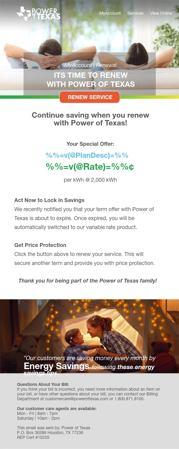
Straightforward Rates
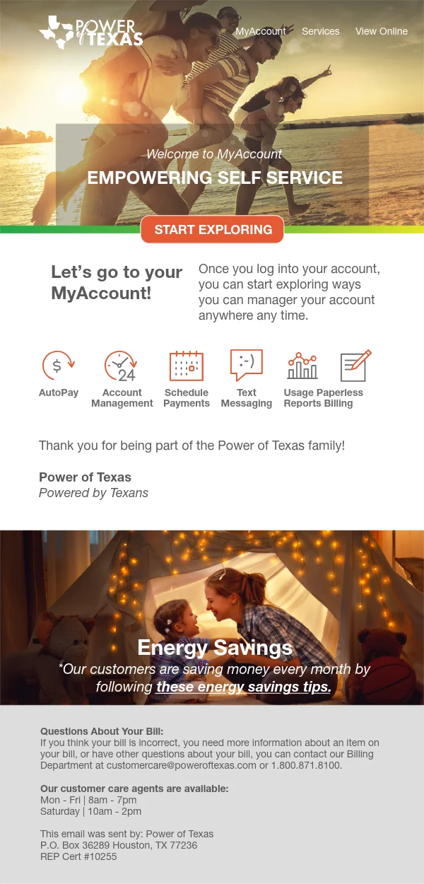
UX and brand design for a retail energy utility site — mobile-first plan comparison cards, transparent pricing, and conversion-focused enrollment flow.

ENERGY RATES
PLAN COMPARISON
Every plan in plain sight — so the right one is obvious.
Power of Texas needed to compete in a market where shoppers are already overwhelmed. I designed a comparison experience that surfaces what actually matters — rate, term, and key fees — without making users dig. Mobile-first cards with honest disclaimers reduce hesitation; support content like FAQs and usage guides cut down on support calls. Persistent CTAs keep enrollment one tap away regardless of where on the page the decision gets made.